
Dell Redesign
Project overview
A redesign of Dell laptop websites streamlines customer journey of purchasing a laptop. The redesign simplifies the selection, customization, and checkout processes by reducing 50% of customer tasks and lowering cognitive loads.
The professor, who is the Lead UX Designer from Indeed, at the University of Washington provided this project as a capstone for us to apply the skills we had learned over the course. The professor acted as a stakeholder to simulate working with a client.
Tool
Photoshop
Illustrator
Figma
Role
User researcher
UX designer
UI designer
Method
User Interview
User Persona
Heuristic Report
Wireframe
Prototype
Timeline
Jan - Mar, 2019
Type
Group Project
Key Features
Clean And Sleek Design

The new design eliminates 60% of the text. The content is concise and accurate. Right to the point.
One Design For All

The new design simplifies and showcases the flagship products, targeting different customers.
Showcase Without Losing Personality
Each product line will have an independent page. It not only showcases products, but also demonstrates the strength of the product.
Fast and Simple Checkout
Customers can customize the product with a few clicks without going through several pages. It drastically decreases the cognitive loads.
Design Process
Heuristic report
The first step was to review every aspect of the Dell website and identify its user experience problems from Jakob Nielson's Usability Heuristic. The 29-page long heuristic report gave me a clear understanding of what worked as well as the pain points throughout the user journey.
During this process, I found that Dell has a relatively low point in Situational Awareness, Support Mental Models, and Support User Goals. Also, many inconsistencies emerged on the site.

User Persona

User Interview
We interviewed 15 people with various background and the potential interests in purchasing a new laptop. We provided them with three tasks, which is finding a laptop within the site, choosing the laptop that fits their need, and adding the laptop to the shopping cart. The interview covered the whole journey users will experience through the site, and demonstrated problems on UX design.

Competitor Research
In order to make more informed decisions about the redesign strategy, we evaluated three well-known brands in the marketplace from various perspectives, including product landscape, workflow, visual design language, and content strategy.
Main common features among the competitors:
-
Simple and linear user-flow
-
Clear call-to-action buttons
-
No jargon, only the necessary information


Redesign
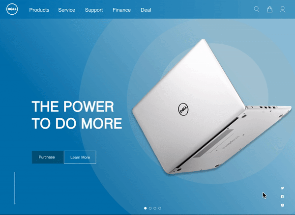
Landing Page


Before
-
Inconsistent use of brand visual elements
-
Too many paths to get into product page
-
Confusing product categories
-
Muscular and cooperative images


After
-
40% less content but serving the same amount of functions
-
Minimalist design with brand identity
-
Narrow down user paths from 17 to 3
-
Clear product categories
-
Gender neutral images
Laptop Page


Before
-
Overwhelming information
-
Tech-savvy terminology
-
Information presented in a busy format
-
Comparisons don't show the differences


After
-
Simplify with less information in a minimalist format
-
Use humanistic terms and pop-up explanations
-
Showcase each product line
-
Highlight the comparison tool
-
Clear CTA for each product line
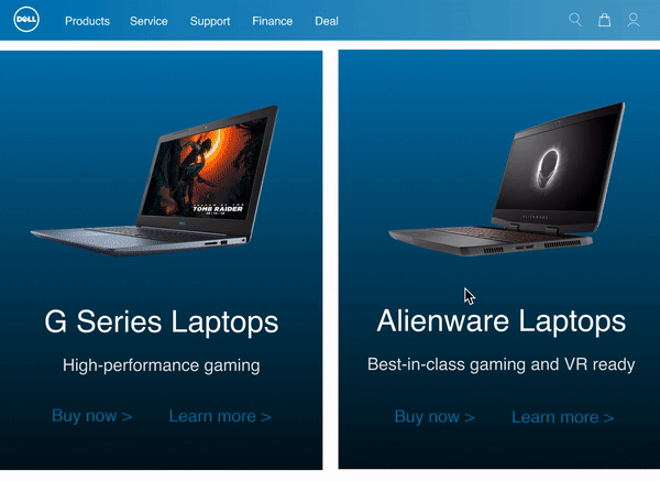
G Series Page


Before
-
Unable to tell the main product features
-
Filters and products didn't sync
-
Similar and confusing product images
-
No comparison among products


After
-
Strong hero images highlighting the unique product specs
-
Feature the key factors that would influence users' purchasing decisions
-
Easy-understanding copywriting
-
Clear product categories
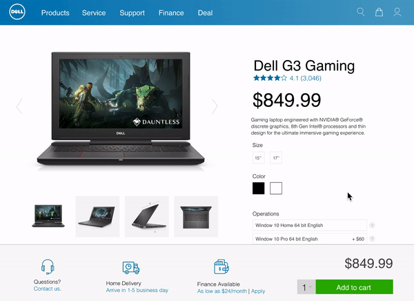
Checkout Page


Before
-
Unable to find a Add to Cart button
-
Selecting configurations is complicated
-
Unexpected steps before checkout
-
Mutilple pages to complete an order


After
-
Visible and fixable CAT buttons
-
Streamline customization in one page
-
A pop-up notification to confirm the Add to Cart action
-
Reduce checkout page numbers from 5 to 1 while remaining the same functions
Results & Impact
50%
Reduced cognitive loads for customers
73%
Fewer steps to complete an order
3.7 min
Faster in the checkout process
14
Nav paths reduced in the workflow
Other projects


Case study

